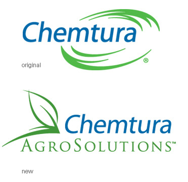
For legal reasons Chemtura had to stay the same font and color, but the new name and the agricultural roots of the new company are called out in the new logo.

Micro was very torn on changing their logo and there were many who did not want to change it at all—the biggest driver was that the company now represented multiple species so the cattle head in the logo no longer made sense. The four diamonds and their resepective colors had equity representing different sections of the business and the forward moving arrow was an important message for them. Minor font tweaks and a shift from the four smaller diamonds adding up to one larger diamond to, instead, becoming the forward moving arrow simplified and modernized the logo mark.